MCS 275 Spring 2024 Worksheet 10
- Course instructor: Emily Dumas
Topics
This worksheet focuses on Matplotlib as covered in Lectures 24--26. It also makes use of the material on Julia sets from lecture 23.
Resources
These things might be helpful while working on the problems. Remember that for worksheets, we don't strictly limit what resources you can consult, so these are only suggestions.
- Lecture 23 - Julia sets
- Lecture 24 - matploblib 1
- Lecture 25 - matplotlib 2
- Lecture 26 - databases (and a little matplotlib)
- VanderPlas:
- Chapter 2 covers numpy
- Chapter 4 covers matplotlib
-
- Especially /numpy_matplotlib/
- MCS 260 course materials from Fall 2021:
To think about
There's a section of this document with some advice about how to work on it. I suggest checking that out, but for the sake of getting straight to the problems it's at the end instead of the beginning.
1. A few functions
Matplotlib is not a perfect tool for making graphs of functions (because it doesn't know about continuity, domain, etc.; it just plots data point). But it can be used for this. To get started working on your own with matplotlib, make plots of the following functions according to the given specifications:
A single figure shows a range of 1 to 20 on the x axis and 0 to 600 on the y axis. The graphs of four functions are shown:
- $f(x) = 100 \log(x)$ is shown in a thin, dotted black line
- $f(x) = 15x$ is shown in dark blue
- $f(x) = 10x \log(x)$ is shown in orange
- $f(x) = x^2$ is shown in red, with a thicker line
(In these expressions, $\log(x)$ means the natural logarithm, which is the usual mathematical convention and is consistent with the name in numpy. The same function is sometimes called $\ln(x)$.)
The x axis should be labeled "x", and the y axis should be labeled "Instructions executed".
The plot should have a legend showing which function corresponds to each color and line style.
You should use 50 sample points when computing the arrays for these plots, and for the plot of $f(x) = 15x$, the individual data points should be marked with dots (in addition to the line running through them).
The plot should have an overall title "Several functions".
2. Nuclides scatter plot
Every atom has a nucleus that contains protons and neutrons. The number of protons determines what chemical element the atom corresponds to, e.g. a hydrogen nucleus has one proton, a helium nucleus has two, and a carbon nucleus has 6. My favorite element, tin, has nuclei with 50 protons.
The number of neutrons can vary from one atom of an element to another. Most carbon atoms have 6 neutrons, but some have 7 or 8. These are called isotopes of carbon. The 6- and 7-neutron carbon atoms are stable (they don't break apart on their own), while the 8-neutron ones are unstable: in time, such atoms undergo radioactive decay and turn into another element.
The term nuclides refers to all isotopes of all elements. That is, it refers to all the possible nuclei that exist. While you're probably familiar with the periodic table containing about 115 elements, there are thousands of nuclides.
Using data from the International Atomic Energy Agency API, I've constructed a CSV file containing data about 2935 nuclides. I selected the ones that are either stable or have a limited degree of instability (each nucleus typically surviving for at least 1 millisecond). Here's a link to the file:
There are five columns in this file:
symbol: The two-letter symbol for the corresponding chemical element (str)neutrons: The number of neutrons (int)protons: The number of protons (int)instability: A number between 0.0 and 1.0 which measures how unstable the nuclide is. (See below if you want a more detailed explanation.) A value of 0.0 means stable or very slow decay; 1.0 means fast decay. (float)abundance: Among all nuclides with this number of protons, what percentage have this number of neutrons. Between 0.0 and 100.0. (float)
Make a scatter plot in which
- Each nuclide is marked by a dot
- The number of neutrons is the x coordinate of the dot
- The number of protons is the y coordinate of the dor
- The dots are small enough to not overlap, but big enough to be seen
- The color of the dot indicates the degree of instability
- The dots come in two sizes:
- Small dots for nuclides with an abundance less than 5%
- Big dots (three times as large) for abundance of 5% or greater
- There is a title "Nuclides with half-life at least 1ms"
- The x- and y-axes are labeled
- There is a colorbar
When you're done, you'll have created something similar to the live web-based visualization system on the IAEA Live Chart of Nuclides. If you want, you can use that site as a reference for certain aspects of what your plot will look like. (That site colors points by type of decay by default, but can be configured to color by stability using the menus.)
Loading CSV files by columns
You might recall in lecture 25 I wrote some code to load a CSV file into a dictionary mapping column names to arrays of values, and that was helpful for making scatter plots. You'll want something similar for this problem, so here is a polished version of that code you can use. You just call csv_columns(fn) with fn replaced by a filename to get such a dictionary as the return value.
The popular Python module pandas provides similar functionality and much more, but as we haven't talked about it yet, we adopt this simple and direct approach.
import numpy as np
import csv
import collections

def best_guess_type_conv(L):
    """
    Make a guess about the type of values represented
    by the list of strings L.  Convert to integers if
    possible, floats if not, and keep as strings if
    both of those fail.
    """
    try:
        V = [float(x) for x in L]
    except ValueError:
        return L[:]  # not floats -> keep as str

    W = [int(x) for x in V]
    if V==W:
        # Converting to int did not change any
        # values; so they seem to be integers.
        return W

    return V

def csv_columns(fn):
    """
    Read a CSV file with headers and return
    a dictionary whose keys are column names
    and whose values are numpy arrays
    """
    columns_raw = collections.defaultdict(list)

    with open(fn,"r",newline="",encoding="UTF-8") as fp:
        reader = csv.DictReader(fp)
        for row in reader:
            for field in row:
                x = row[field]
                columns_raw[field].append(x)
    columns = dict()
    for colname, coldata in columns_raw.items():
        V = best_guess_type_conv( coldata )
        if isinstance(V[0],str):
            columns[colname] = V
        else:
            columns[colname] = np.array(V)
    return columns
Footnote: What instability measurement is
You don't need to read this section. It contains more detail about what the instability measurements in nuclides.csv really mean.
The column instability contains a number $x$ that is computed from the half-life $\lambda$ of the nuclide (measured in seconds) as follows:
For example, if the nuclide is stable, then $\lambda = +\infty$ and $x=0$. But if it is very unstable, $\lambda$ will be near $0$ and so $x$ will be close to $1$.
Recording $x$ in the data file rather than $\lambda$ makes it a little easier to construct a scatter plot.
3. Julia with matplotlib
In Lecture 23 we worked on a notebook for making pictures of Julia sets. We ended up with nice pictures like this one:

But they were created by passing numpy arrays directly to Pillow, so they don't come with axes or labels or any information about what part of the complex plane you're seeing.
Adapt the code from that notebook to generate an image of a Julia set and then display it in a matplotlib figure using plt.imshow(). The desired output would look something like this:
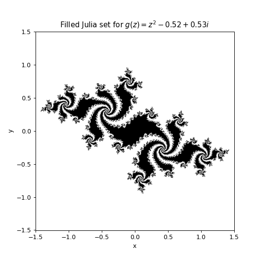
Hint
You need to pass the extent keyword argument to imshow to tell it the limits of the x and y axes. Check out Section 4.04 of VanderPlas for details.
General Suggestions
Advice on how to work on this and other matplotlib-related activities in MCS 275.
Keep VanderPlas chapter 4 open in a browser tab
For the purposes of this worksheet, the online text by VanderPlas is the main place to look if you want to do something in matplotlib and don't remember how.
Work in jupyter or colab
It's a good idea to work on this worksheet in the Jupyter/ipython notebook environment. For most people, these commands in the shell will install the prerequisite modules and launch a browser with the notebook environment:
# Install stuff
python3 -m pip install notebook numpy matplotlib

# .. now you should cd to where you want to work ..

# Launch notebook
python3 -m notebook
Another option is to use Google Colab which has matplotlib pre-installed. You can do everything there if you like, but steps that involve files (reading or writing) are a little simpler if you use matplotlib installed on your own computer. If you do plan to use Colab for everything, check out the documentation notebook for details on the ways you can work with files there.
Standard template
I suggest starting every matplotlib notebook with:
import matplotlib.pyplot as plt
import numpy as np
Colors
Remember, matplotlib accepts both
- Named colors (e.g.
"red"), of which there are many) - Hex colors (e.g.
"#FF0000"is red,"#0000FFis blue)
The latter is useful with an online color picker that lets you choose visually and then see the hex code.
Bigger plots
The default figure size used by matplotlib might be a little small. If you find that to be the case, I recommend adjusting the output plot size by starting your figure with this command:
# Use a resolution expected to result in a figure 8 inches wide, 6 tall, on a display that
# has 120 pixels per inch
plt.figure(figsize=(8,6),dpi=120)